
Some projects feel like work. And then there are the ones that feel like something else entirely. This was one of those.
Stephanie came to me a little hesitant, having had a previous branding experience that didn’t quite land the way she’d hoped. Her brand isn’t just a logo and she knew that better than anyone. It’s her name, her story, the business she built from the ground up as a single mom while raising her kids and showing up fully for every single client along the way. Handing that over to someone new takes courage, and when she reached out, I didn’t take that lightly.
Getting to Know Stephanie
Before a single design decision was made, I needed to understand who Stephanie actually is — not just what she does, but how she moves through the world.
What came through immediately was her heart. Stephanie’s a family and newborn photographer based in Windsor, Ontario, with over a decade of experience behind the camera. She’s built her reputation not just on her skill, but on the kind of presence she brings to every session. She described leaving each shoot feeling like she’d made a new best friend, and I believed her completely.
She’s also deeply spiritual. Numerology, astrology, and a quiet trust in the way things unfold have always been central to how she lives and runs her business. Her kids were born on dates that line up in ways that still make her smile, and she launched her business on her son’s first birthday. Numbers and timing mean something to her, and that wasn’t something I was going to gloss over.
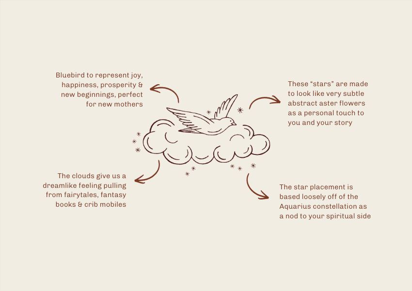
She also mentioned, tucked near the end of her questionnaire, that the aster flower held a deep personal significance for her. She’d quietly woven it into a corner of her existing website in a way that most people would never notice. She wasn’t sure if there was room for it in something new, but it was important to her that it carried forward somehow. It absolutely did.
The Creative Direction
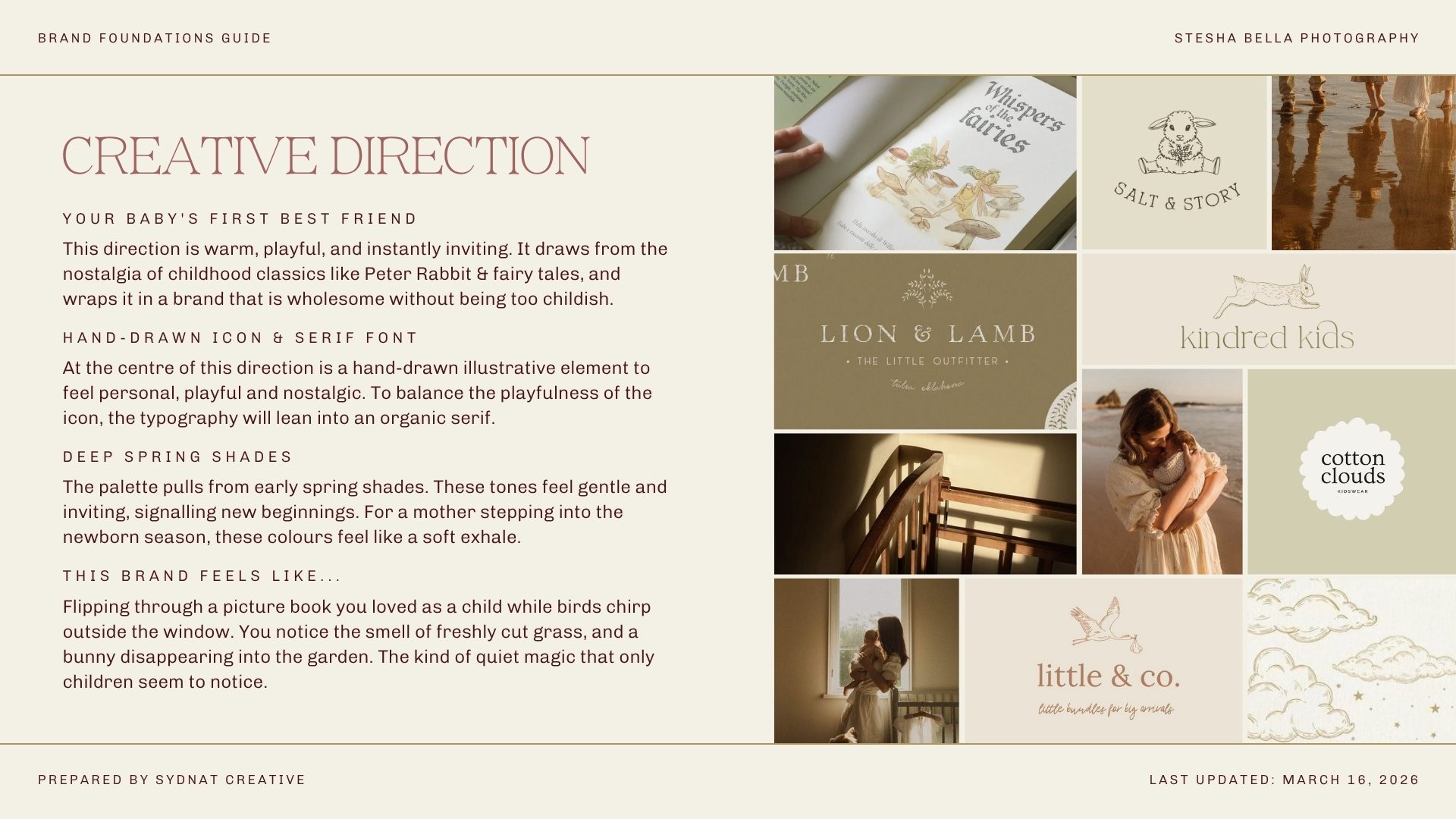
Stephanie wanted her brand to feel like a best friend. Playful, wholesome, and organic. She wanted mothers to land on her website and feel like they had found their person — not just a photographer, but someone who was genuinely going to show up for them during one of the most vulnerable seasons of their lives.
The direction we landed on pulled from the nostalgia of children’s fairytales and picture books. Think Peter Rabbit, gingham, soft spring palettes, and the kind of warmth that feels familiar before you can explain why.
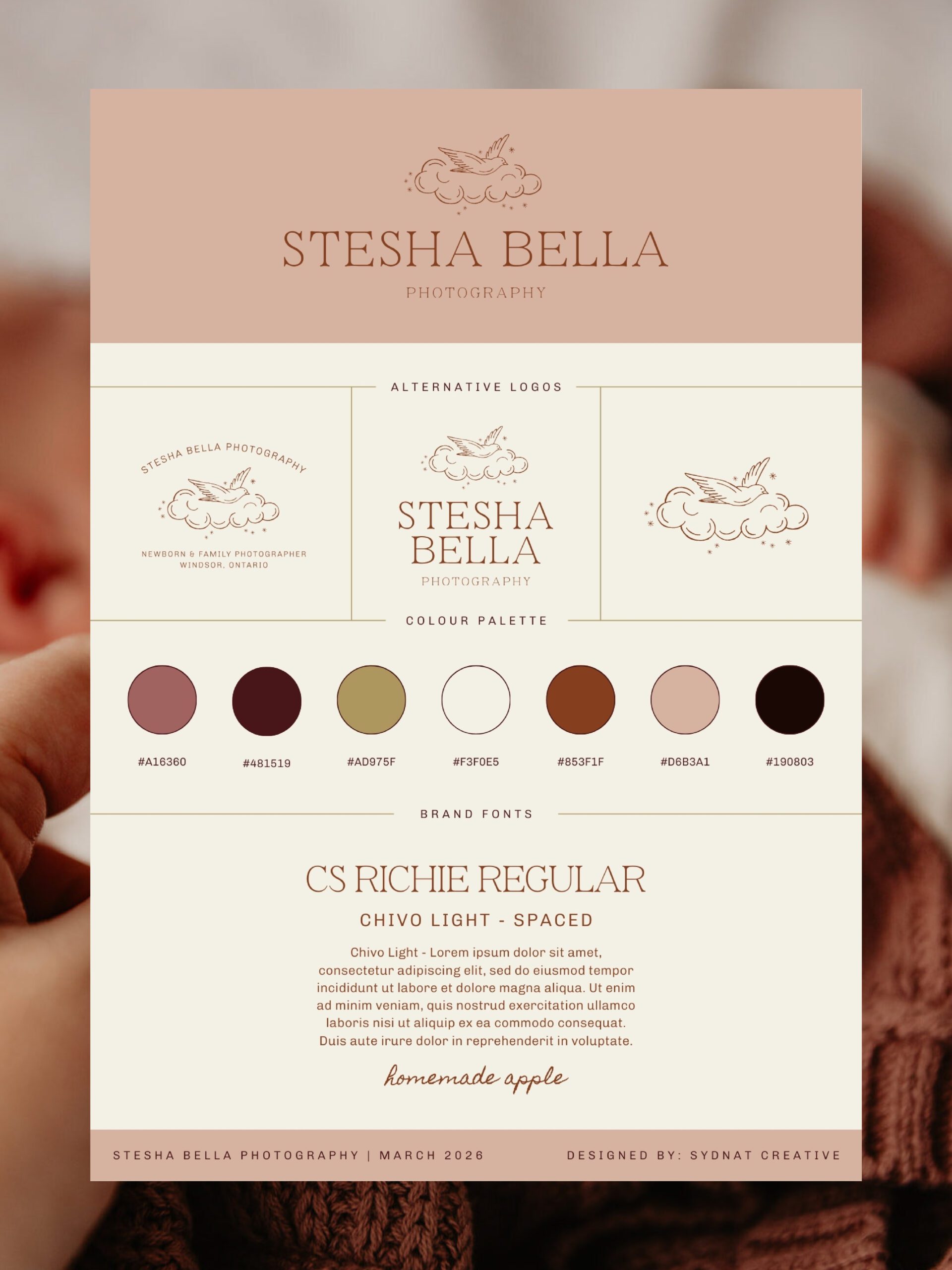
At the centre of the brand is a custom illustrated logo: a bluebird perched on a cloud, surrounded by stars. Every element was chosen intentionally. The bluebird represents joy, new beginnings, and prosperity — everything a new mother is stepping into. The clouds carry that dreamlike, fairytale feeling, the kind you find in a crib mobile or a book your grandmother read you. The stars aren’t just stars. They’re drawn to loosely echo the Aquarius constellation, a quiet nod to Stephanie’s spiritual side that her ideal clients may not notice right away but that she’ll always know is there. The shape of the stars are abstract aster flowers — a small personal touch.
What Stephanie Said
When Stephanie saw the final brand, she said it felt like everything had finally aligned — that she could finally show up as herself, and that the brand would attract exactly the clients she wants to serve.
She also said this, and I haven’t stopped thinking about it since: being reminded of her power through this process helped with imposter syndrome. It gave her a nudge that what she does matters, who she is matters, and who she serves matters.
That’s the whole job, right there.
On Working Together
Stephanie described our process as easy, flexible, and full of alignment. She said I listened — which is honestly the thing I’m most proud of. When her ideas were everywhere and nowhere, we found the thread together, and when she had doubts, we worked through them. Nothing felt unclear and the timeline felt right from start to finish.
The Timing
Stesha Bella Photography launched on the spring equinox. A new season, a fresh start, and a brand that finally feels right. I don’t think that was an accident.
Your brand should feel this way too.
If you’ve been sitting with the feeling that your current branding doesn’t quite reflect who you are or the work you’re actually doing, that feeling is worth listening to. This is exactly the kind of project I love — the ones where we get to build something that’s genuinely, quietly, unmistakably you.
If you’re ready for that, I’d love to hear from you.


