
If you’ve ever spent an afternoon falling down a font rabbit hole, you already know how overwhelming it can get. There are thousands of options out there and most of them are not right for a wedding brand, even if they’re technically pretty. The fonts that actually work are the ones that feel cohesive with your overall aesthetic, hold up at different sizes, and communicate something specific about who you are and who you serve.
So I’ve done a bit of the work for you! These are six fonts I genuinely love for wedding brands right now — a mix of free and paid options across a few different styles.
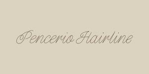
01. Pencerio — Script | Available on Fontshare (free)
Pencerio is one of those scripts that manages to feel both delicate and confident at the same time, which is a tricky balance to strike. The letterforms are thin and flowing without tipping into illegibility, making it a great choice for accent text, subheadings, or a secondary logo element. It pairs beautifully with a clean serif for a classic, refined feel.
Download Pencerio on Fontshare
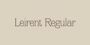
02. Leirent — Serif | Available on Craft Supply Co. (paid)
Leirent is a light, airy serif with a lot of quiet elegance to it. The thin strokes and generous spacing give it a really calm, unhurried quality that works well for wedding brands that want to feel intentional without feeling heavy. It’s the kind of font that sits beautifully in a logo or as a headline font on a website with lots of white space.
Get Leirent on Craft Supply Co.
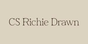
03. CS Richie Drawn — Serif | Available on Craft Supply Co. (paid)
This one has a little more personality to it. CS Richie Drawn has that high-contrast serif quality that feels editorial and timeless, with just enough character to keep it from feeling generic. If you want your brand to feel elevated and a little unexpected, this is a great one to explore — especially as a display or logo font.
Get CS Richie Drawn on Craft Supply Co.
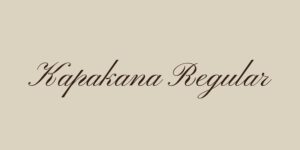
04. Kapakana — Script | Available on Google Fonts (free)
Kapakana is a gorgeous, flowing script with a lot of movement and warmth to it. It’s the kind of font that immediately reads as romantic and celebratory, which makes it a natural fit for wedding brands. Because it’s available on Google Fonts for free, it’s also incredibly easy to implement directly into a website without any licensing headaches.
Download Kapakana on Google Fonts
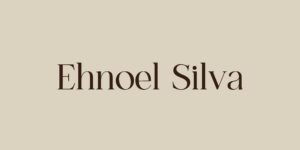
05. Ehnoel Silva — Serif | Available on Creative Market (paid)
Ehnoel Silva has a distinctly high-fashion, editorial quality that sets it apart from the more traditional wedding serifs. The wide letterforms and strong contrast between thick and thin strokes give it a real sense of presence on the page. If your brand is leaning toward something more sophisticated and less expected, this one is worth a look.
Get Ehnoel Silva on Creative Market
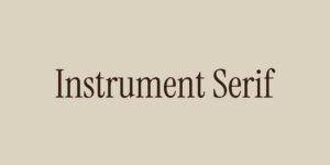
06. Instrument Serif — Serif | Available on Google Fonts (free)
Instrument Serif has been having a bit of a moment, and for good reason. It’s a transitional serif with a warmth and approachability that a lot of traditional serifs lack. It reads as refined and trustworthy without feeling stiff, which makes it incredibly versatile for wedding brands. It works well as a body font, a headline font, and even in a logo — which isn’t something you can say about most serifs. The fact that it’s free on Google Fonts is just a bonus.
Download Instrument Serif on Google Fonts
How to use these well
A few quick thoughts before you run off to download all six — which, I totally understand the urge!
You generally want to work with two fonts at most in a brand, sometimes three if there’s a very intentional reason for it. A common pairing approach is one serif for headlines and one script for accents, or a serif and a clean sans-serif for body text. The goal is contrast that feels intentional, not chaos.
And if you’re using any of these on your website, always check how they render at smaller sizes and on mobile. A font that looks stunning in a mockup can sometimes behave differently in a live web environment, especially the more decorative scripts.
Want help putting it all together?
Choosing the right fonts is just one piece of building a brand that truly feels like you. If you’re at the point where you want everything to work together cohesively — from your typography to your colours to your overall visual identity — that’s exactly what I do at Sydnat Creative.
I’d love to help you build something that feels calm, confident, and genuinely yours.


